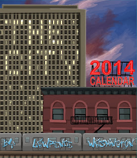
2014 Calendar - Rejected Ideas
So I figured for a little bit of fun I'd show you some of the ideas I had to abandon. I don't think any of them are bad, I just felt they didn't fit the overall piece. Enjoy:
Cover Drafts
This is the first idea I had. I wanted to have a picture on the cover that used elements of all of the pictures in the calendar. But once I was finished, I thought it looked too busy and that the words were too hard to read.
This is the second draft. I had an idea of creating a skyline in white space to make the pictures pop. But the design could use some work.
This is another take on the idea. I figured adding outlines and using a more arty font would liven things up. This was the cover for a few days until I printed out a few test copies and the whole package had this 'cheap' feeling to it. So ultimately I went with the design in the final version. More on how the final version came to b be is coming up...


Comments
Post a Comment
Share your thoughts!