2014 Calendar
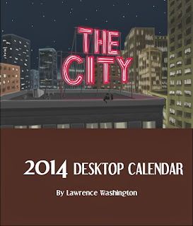
It's that time of the year again. the current iteration of what seems like a tradition for me, I have chosen a concept called "The City". This series began as a tribute to the work of Edward Hopper. If you are a fan of his work, you should notice the influence in a lot of the pictures. This project took about three months to complete, starting on September 1st to the end of November. The poster took the longest, due to the many details that went into it. I made a total of 125 calendars. Printed and assembled at home. I wish the cost of mass producing these was a lot cheaper. During the course of the coming year I will research print companies to see if I can find a cheap and easy solution for getting these made. Anyway, here is the full set from this series. Enjoy.
Cover
January
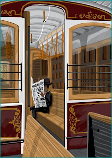
This went through several drafts before I settled on a final design. Though I never had a clear design in mind when I started this, I knew wanted to create an art piece with old buildings and fire escapes. I like the mood this evokes. It looks like early morning. The city could be any city, but I think I used Chicago for the building design. I originally planned to use graffiti on the subway car, but I decided that it wouldn't work for this setup.
February
The idea for this came from "Early Sunday Morning" From Edward Hopper. The building design is a lot difference than what he used, but the mood is the same. I like the light source. It allowed me to experiment with a different art style. Oddly enough, this project marks the first time I've drawn buildings in this much detail. I had fun learning what my capabilities are. I even learned a few new techniques.
March
Any Hopper aficionado will recognize this as "Night Windows". it has long been my favorite of his and I have always wanted to pay homage to it at some point. This project felt like the perfect time. Oddly enough, this is the third design concept for March. I completed two whole pictures before coming to this one.
April
I had to put my daughter in at least one of these. She demanded it. Not really, but I do like to make her feel included. She puts up with me working on my artwork all the time, so it was the lease I could do. I like the tone of this because it shows what it's really like when we go out to eat; quiet and relaxing.
May
Starting with this one and ending in August, I went for a more abstract approach, rather than spelling the months out the normal way. People like my girlfriend have trouble seeing how these buildings spell out "MAY", but my daughter picked it up right away. I like it. The idea came to me when I was in Manhattan in New York back in 2012. When I looked up at the buildings, I had this idea of them spelling something out. At the time, the idea was unclear, but I remembered it for this project.
June
This idea came by accident. I had a sketch of what June would be, but it was nothing like this. I think I was going to have a woman wearing a leather jacket with studs on it spelling out "June". The idea was scrapped when I sketched it out and I thought the idea was stupid. So I took a break and started watching TV. I'm not sure where, but I saw an image of a roller coaster, and I had my Eureka! moment. Not sure how to add it to this series, I recalled that Coney Island is in New York. While it isn't technically in the city, it's close enough. I wanted an image that evoked the mood of summer, so this is what I came up with.
July
I had a personal goal of challenging myself in every piece that I do. To me, drawing crowds of people is a huge challenge. I think it turned out great despite the fears I had. Also I had to completely redo the marching kids in the forefront. In the first draft, the kids wore different color clothes and that made it hard to read what the flags spelled out. It's around this point where I got tired of drawing streets. When I came up with this idea, I didn't realize I had to include so much detail. I took a week-long break after this one.
August
I have a weird obsession with fire escapes; I've always wanted to live in a building that had one. Is that weird? I dunno. In any case, this is one of my favorites of the series. I like the extreme angle. You don't see too many pictures from inside of a fire escape.
September
This is another favorite of mine. I rarely included other people in my pictures. I'm not sure why, but I guess I only liked drawing myself. It was all I was comfortable with. Nowadays, I've stepped out of that comfort zone.
October
Chicago natives will recognize this place right away; the old Chicago Theater. I love the look of the place. I felt it was perfect. Unlike the rest of the pieces in this series, I started this on a black background and added the lighting elements from there. It made it easier to convey a night scene. I sure hope someone picks that woman up soon. I'm sure it's a cold night.
November
Being from the SF Bay area, I had to include San Francisco in at least one of these. I tried to make "The City" anonymous but in this case, I guess I couldn't help it. I've never drawn a cable car before. Considering this is my first time, I think it came out pretty good.
December
As a kid, I always liked the Christmas displays in the storefronts. Walking downtown and seeing all of the decorations is something I always enjoyed. This year, I didn't really get to do much of that, which is a shame. This place is modeled after a Macy's store. The street scene at the bottom inspired the poster that I included with the calendar set.
Poster
Personally, I feel this is the coolest thing I've ever done. I like to include a bonus with my desk calendars. Usually I make a companion magnet that people can put on their fridge. This time, I wanted to include a poster. But rather than make a poster that is a compilation of all of the pictures, I went with something different this time around. I came up with the concept of a street scene with different types of buildings, using the windows to make the calendar grid. The first section is morning in a not-so-great part of town. The second section is a Chicago/New York style downtown street with an elevated train in midday. The final scene is kind of a mix of San Francisco and New York at sunset. it was an ambitious idea. I think I pulled it off. Here are the different sections in detail:


Comments
Post a Comment
Share your thoughts!