Posts

Showing posts from 2013

2014 Calendar - Rejected Ideas Part 3

Image
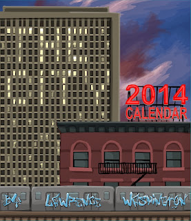
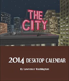
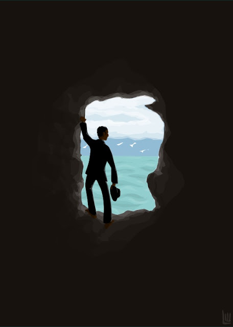
March For this series, this is actually the first picture I started on. I got the idea from looking at Edward Hopper's "Night Windows" and said : I want to make a calendar series with pictures like that! At this point in time, I hadn't drawn anything for a few months (Stress related. Sensitive artist and all that).  When you compare this to what ended up in the series, it's like night and day. You can tell here that my skills need work. I had no idea what to do with the lighting, the colors are hideous, and the person is drawn horribly. I like to put this next to the finished one to see what a difference practice makes. Does this look familiar? I ended up using this as the image for the cover, but it actually started out as the image for March.  After the abysmal first attempt for March, I decided to do the pictures in order. As you read from the January drafts, that didn't go smoothly, but I eventually found my rhythm. When I came around to

2014 Calendar - Rejected Ideas Part 2

Image
January I started this one not really knowing how the series would come together. I envisioned a series of pictures with "Hopper-esque" influences but that's about it. I remember spending too much time worrying about the staging of this scene and what elements should go in it. I spent a great deal of time adding details to the buildings and the train, then went to bed. The next morning, I looked at the whole piece again and hated it. I still gave it another shot and added people to the scene but I ultimately gave up on it. I didn't even bother adding details to the sky. I really like this one. With the movement of the background and the cool train in the forefront, I think it's a really cool image on its own. But in the calendar, not so much. After I found my rhythm and I finished more pictures in the series, this one looked a bit out of place. It has an overall different feel than the rest of the series, so I took it out and did a whole new one

2014 Calendar - Rejected Ideas

Image
So I figured for a little bit of fun I'd show you some of the ideas I had to abandon. I don't think any of them are bad, I just felt they didn't fit the overall piece. Enjoy: Cover Drafts This is the first idea I had. I wanted to have a picture on the cover that used elements of all of the pictures in the calendar. But once I was finished, I thought it looked too busy and that the words were too hard to read.  This is the second draft.  I had an idea of creating a skyline in white space to make the pictures pop. But the design could use some work.  This is another take on the idea. I figured adding outlines and using a more arty font would liven things up. This was the cover for a few days until I printed out a few test copies and the whole package had this 'cheap' feeling to it. So ultimately I went with the design in the final version. More on how the final version came to b be is coming up...

2014 Calendar

Image
It's that time of the year again. the current iteration of what seems like a tradition for me, I have chosen a concept called "The City". This series began as a tribute to the work of Edward Hopper. If you are a fan of his work, you should notice the influence in a lot of the pictures. This project took about three months to complete, starting on September 1st to the end of November. The poster took the longest, due to the many details that went into it. I made a total of 125 calendars. Printed and assembled at home.  I wish the cost of mass producing these was a lot cheaper. During the course of the coming year I will research print companies to see if I can find a cheap and easy solution for getting these made. Anyway, here is the full set from this series. Enjoy. Cover January This went through several drafts before I settled on a final design. Though I never had a clear design in mind when I started this, I knew wanted to create an art piece with

Merry Xmas 2013

Image
It's Xmas time and I've been very busy; artistically and otherwise. Stay tuned for more. I made another calendar that I am very proud of...

Envol

Image
Another Superhero French Ad. This time featuring one of my favorite Justice League members, Hawk-girl. She's advertising a water that I made up: The tagline reads: "FLIGHT" Revives you. Strengthens you. Absolutely not for the weak. This is the picture that I used as a reference:

Lightning Courier

Image
Another Vintage Style Poster. I didn't use a reference pic for this one. I just did my best to mimic the retro style. This time, I went French: The text reads: "The Most Reliable Service! Speed is our Specialty!"

Superheroes and Vintage Ads

Image
I love vintage ads for wine and other goods. The best ones are usually foreign of course. I decided to make the first one starring Superman. The slogan says "It's your Savior!" the drink he's schilling is called 'Kryptón, a refreshing drink from the gods. It's modeled after this ad:

Reflection and Shadow

Image
Another quick doodle:

Untitled

Image

The Gateway

Image

In Bloom

Image
I've titled this "In Bloom". It's a bit literal as there are many flowers in bloom. But the world seen through the man's perspective looks a bit different.

Night Flying

Image
My daughter Cyan requested that I draw something for her so I came up with this: Keeping with the theme of surrealism.

Daywalker

Image
Dipping my toe into the abstract world. One of a series:

Drowning

Image
My brain at work again. The man in the black suit and red tie is a recurring character of mine. I like to think I'm like Magritte that way.

The Cave

Image
More of a doodle than a real pic. I had an idea and ran with it. I like the idea of using a solid space and taking a minimalist approach. I like it. I think it invokes a peaceful mood.

Warface

Image
Took another dip into pop-culture land with this one. I love the show 'Boardwalk Empire' and came up with this piece to honor my favorite character, Richard Harrow.  This is a send-up of the famous Scarface poster. (Those who know the show will get the mask reference).

Valentine's Day 2013

Image
I have a thing for old French wine ads. So for this Valentine's Day, I made this and slapped it on a wine bottle for my girlfriend. It translates to: "Two Lovers". The source of inspiration came from an old ad for Ramos Pinto port wine: If I ever make my own wine someday, I already have a label. Bad picture of the bottle:

Father of Apple

Image
I'm not an Apple devotee by any means, but I never ignore a good design when it hits me. At least I think this design is good. One of my favorite artists is Rene Magritte, and his painting "Son of Man" is an all-time favorite of mine. Earlier this week, this crazy idea of making a Steve Jobs tribute popped in my head and I got to work on it. I think it came out pretty good.

Furious Racer

Image
2013 is here so I've decided to have some fun for a change. It's not often that I do Pop Culture, so I wanted to give it a shot. I'm a fan of the Fast & Furious series. This design is my homage. I figured a mash-up with Speed Racer was appropriate. What do you think? (Click on the pic to enlarge)

2013 Calendar

Image
For the past few years, I've been making calendars for my family and friends. This year, I got the inspiration to try different art styles from around the world. This idea became what you will see below. Each month is spelled out in different ways. Some who have seen it admit to not figuring some of the months out right away. And here is what it would look like on your desk: I still have a few left. If you want one, send me an email. I''m selling them for $13 apiece.